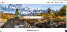
KE have launched its new website and brand identity.
Ashley Toft, KE Adventure's CEO says: “We have been working on our new look for some time; we felt it was time for a brand refresh to take us into our new era and reflect who we are now with our wider range of trips.
“Our website also required updating to improve the speed and functionality and we are excited to introduce this for our 40th birthday year.” In 1984, KE began taking adventurers to the Karakoram Mountains in Pakistan and has constantly grown and evolved since then.
While they were once known for the more extreme side of adventure travel, they have now developed their range to offer over 360 active holidays worldwide. Their customers can now choose from leisurely walking trips in destinations like the Amalfi Coast in Italy and the coastal south of Albania, to trekking and climbing 6,000 metre peaks in Mongolia and the mighty Himalaya.
KE's range of holidays include both guided and self-guided walking, trekking, cycling, mountaineering, wildlife, polar and family adventures, as well as one of a kind pioneer adventure that you simply won't find anywhere else. They are proud of where they are now and can't wait to see what 2024 brings, their 40th birthday year!
Their new website is fresh, cleaner and more contemporary. It allows images to be better displayed in order to help inspire our customers and help them browse and book adventure holidays more easily.
It is also faster, with them having worked on this in stages. And there will be further development coming in 2024.
The new logo incorporates elements from the old one with a more modern feel and they were keen to keep the mountains as these represent an important part of who they are. But they wanted to reflect the other types of holidays they offer too by introducing a softer wavy line for walking or cycling paths.
The box which forms part of their new logo runs through the design of the website, subtly framing the larger images as if in a travel photograph. And, they have introduced new colours.
They have kept the burgundy red to represent heritage and their Himalayan beginnings (it is the colour of Buddhist monks' robes in Nepal and Bhutan), but updated the yellow to be a brighter and more modern coral orange. They no longer include the word travel in their logo as they find that their customers refer to them as KE Adventure.
Their purpose has not changed; they are still the same team, based in Keswick in the Lake District, where customers new and old are always welcome to go in and see us. They still offer the same great choice of adventure holidays with the excellent customer service, that their customers have come to expect from them.
Now with added colour!


